Reach Dem UK’s Website Redesign
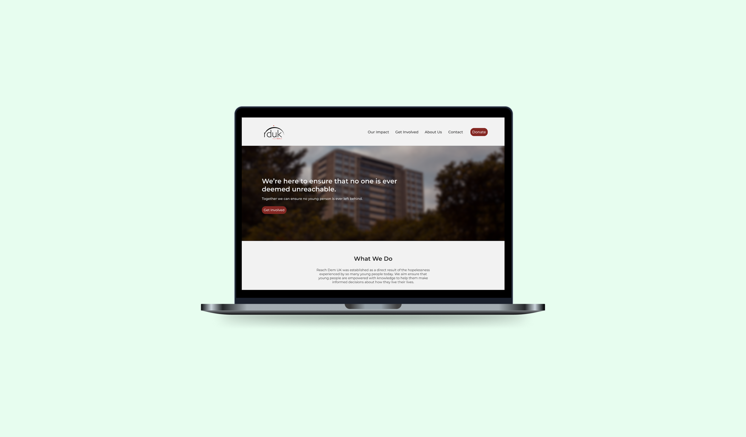
Overview: As part of UAL’s Talent Works programme, I collaborated with a non-profit organisation called Reach Dem UK as a lead designer to redesign their website. The organisation’s mission is to ensure that no one is deemed unreachable by society, supporting young offenders in their reintegration through structured community programs.
Timeline: 2 weeks
My Role: User Research, Wireframing, Prototyping, User Testing & UI Design
The Problem
Although Reach Dem UK has seen growth in its online presence, they are experiencing low volunteer sign-ups across their programs on the website, limiting their ability to build a strong sense of solidarity between community volunteers and beneficiaries.
The Solution
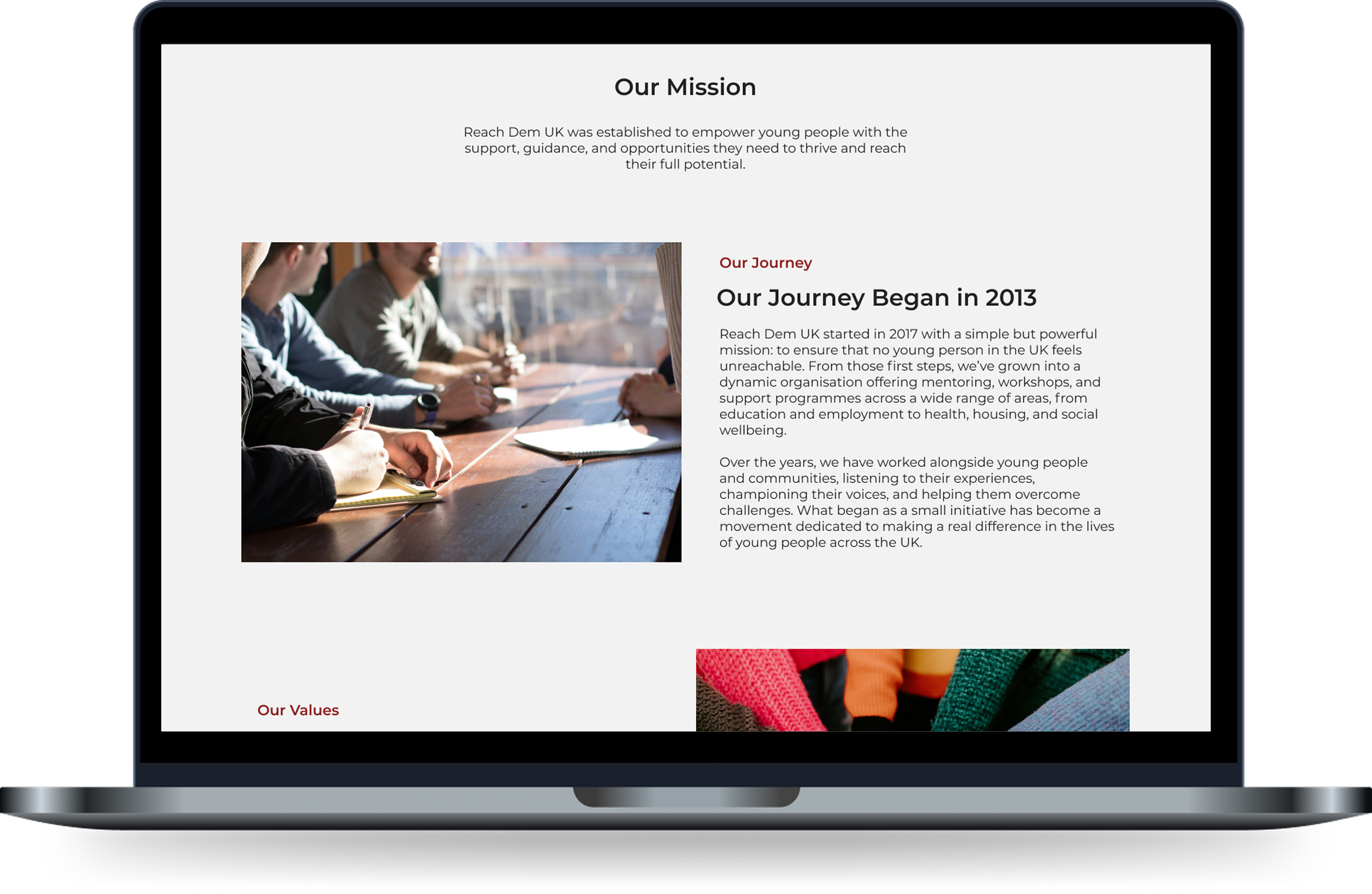
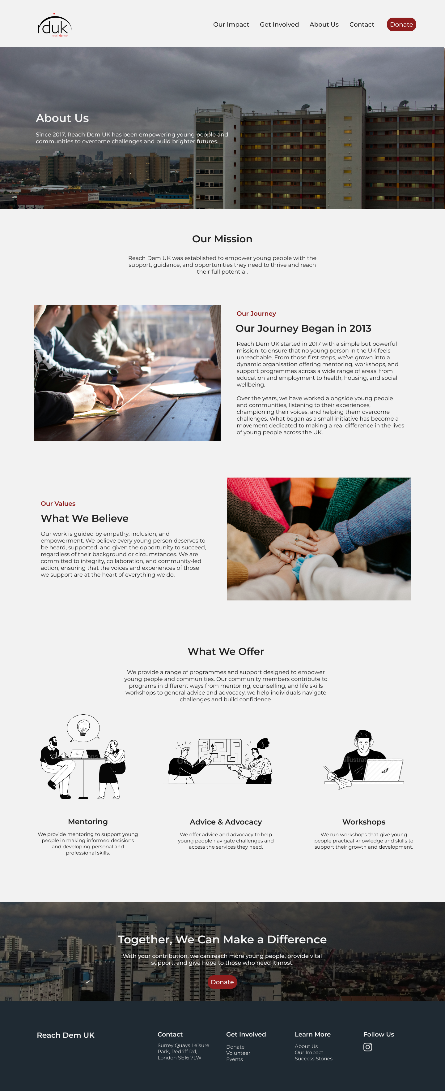
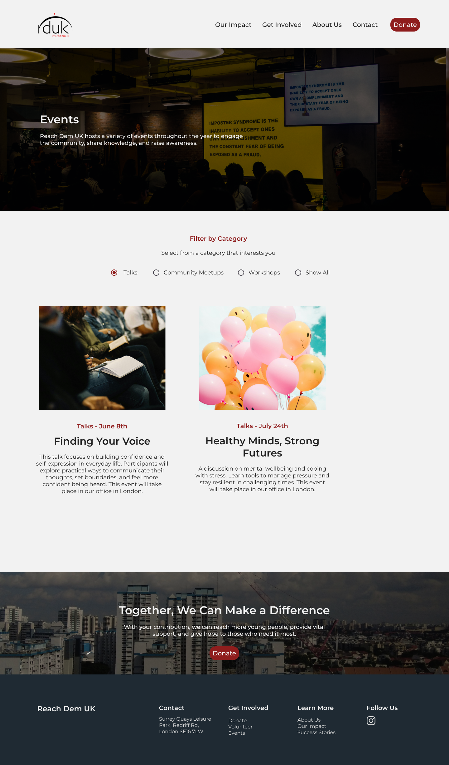
Building Confidence & Trust
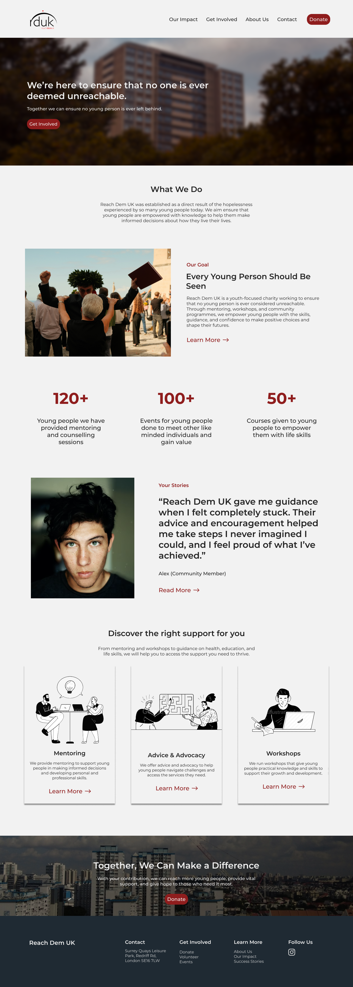
In the home and about page, elaborated more on Reach Dem UK’s mission, values and journey to build confidence and trust with community members. Added a testimonials section to further ensure community members can contribute with confidence.
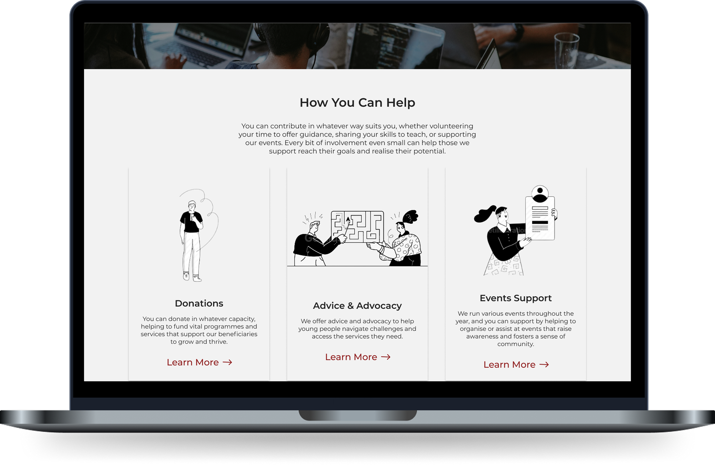
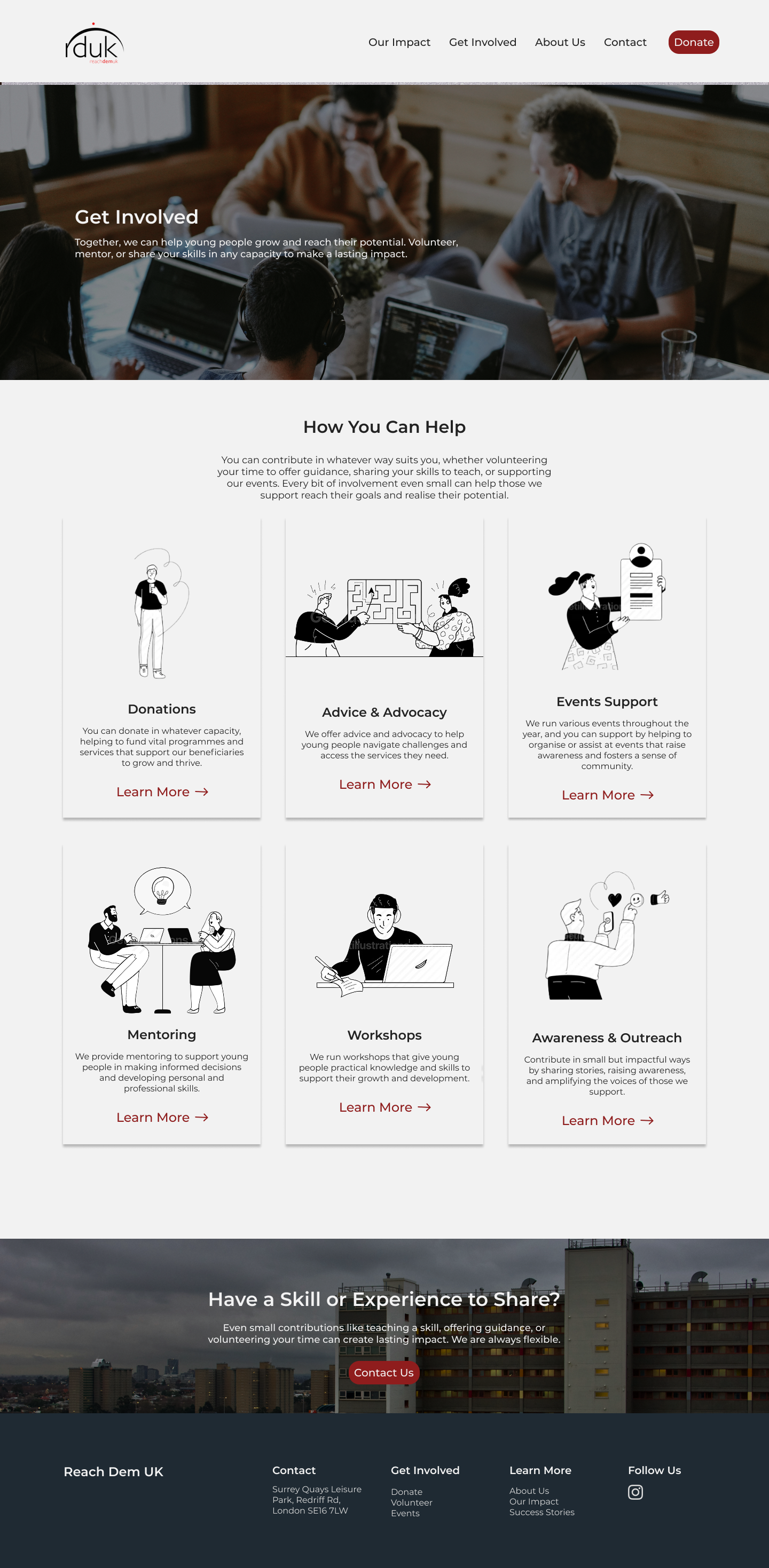
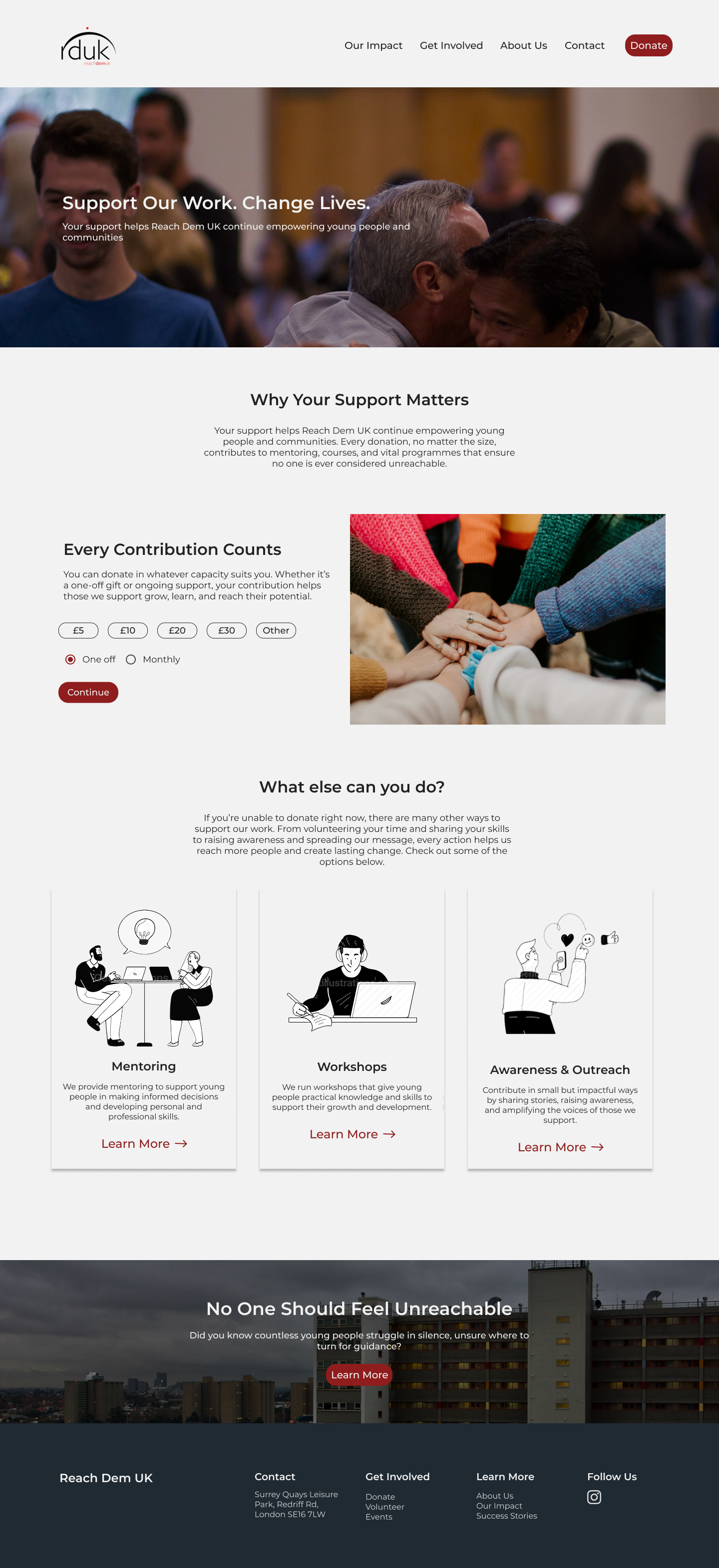
Streamlining How to Get Involved
Simplifying the process of volunteering by integrating a “Get Involved” page, turning it into a one-entry point. Offering flexible ways to contribute, which include low-effort options that still have a strong positive impact on the organisation and the beneficiaries’ lives. Ultimately, reducing the friction in the process of getting involved.
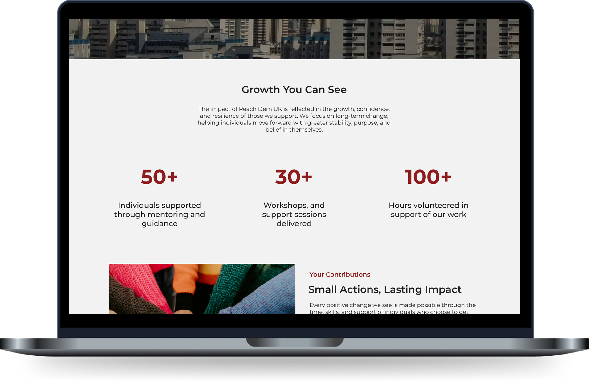
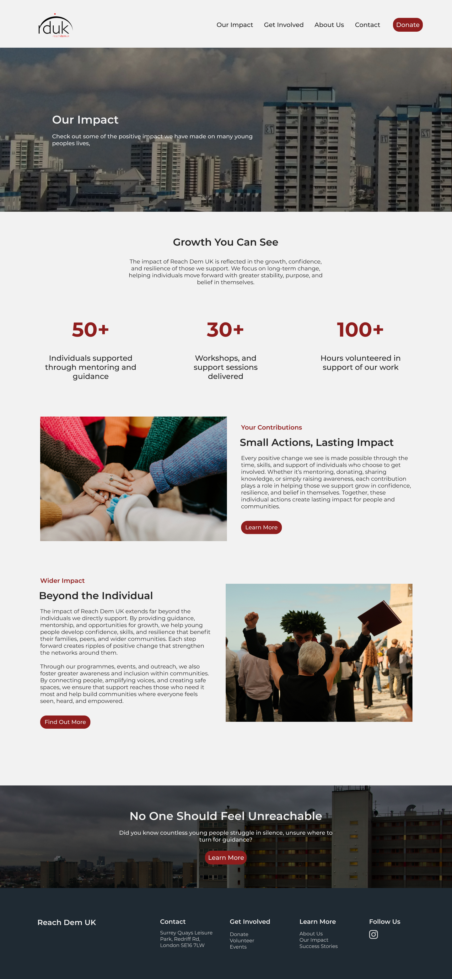
Introducing “Our Impact” Page
Introduced an “Our Impact” section, which gives further insight into Reach Dem UK’s positive impact on young people's lives and demonstrates how all volunteers’ contributions are positively impacting young people’s lives.
Process
Competitive Analysis + Identifying the Weaknesses
The initial step was to conduct competitive analysis to identify what other similar non-profit organisations are doing and identify best practices and common design patterns for our website redesign. Doing a competitive analysis helped to identify key weaknesses in the current Reach Dem UK website and draw inspiration from specific features we admired in other non-profit organisations. These were some of the non-profit organisations we looked at and analysed.
Key Insights From Competitive Analysis:
Conducting the competitive analysis led me to identify key weaknesses in the current Reach Dem UK website, which I mapped out below.
Confusion about how to get involved and support Reach Dem UK’s programs.
Lack of flexibility when it comes to volunteering options.
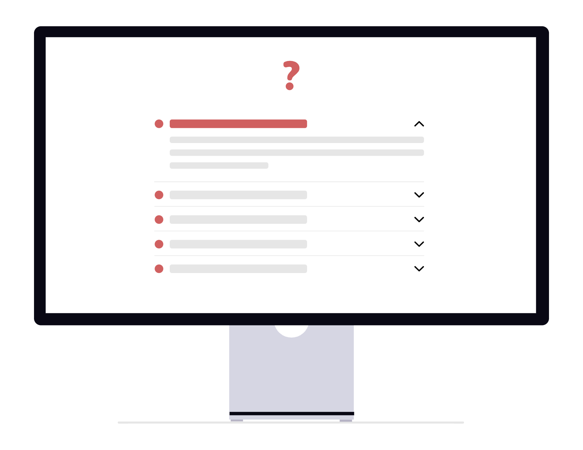
Over-reliance on static information pages with limited interactive elements and CTAs.
User Interviews + Synthesising Findings
Building on the insights derived from competitive analysis, I conducted interviews with 10 Reach Dem UK’s community members to understand their experiences being involved with the organisation and identify the challenges they are currently facing. The goal was to also gain an understanding of their motivations and desires behind which specific causes they support. The next step was to synthesise findings through an affinity mapping exercise to find common themes and patterns.
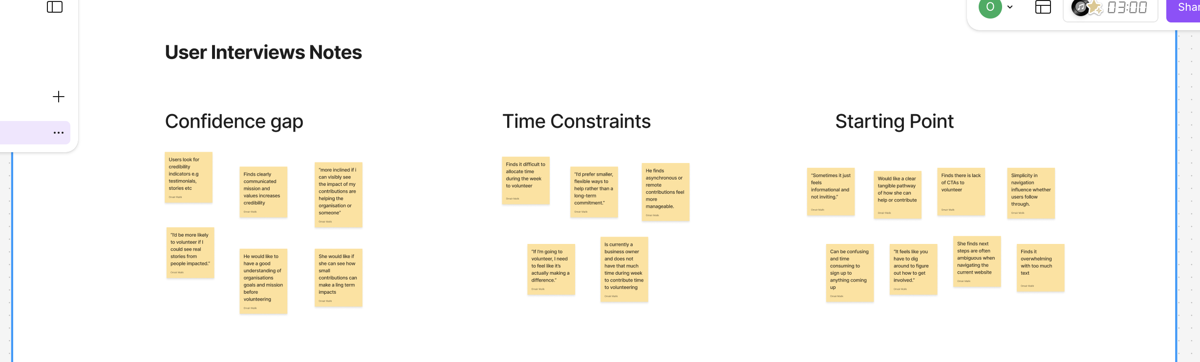
Key Insights From Research Synthesis
Confidence Gap
Users want to contribute, but insufficient visibility of impact, volunteer stories, and organisational credibility reduces confidence in engaging with programs.
Time Constraints
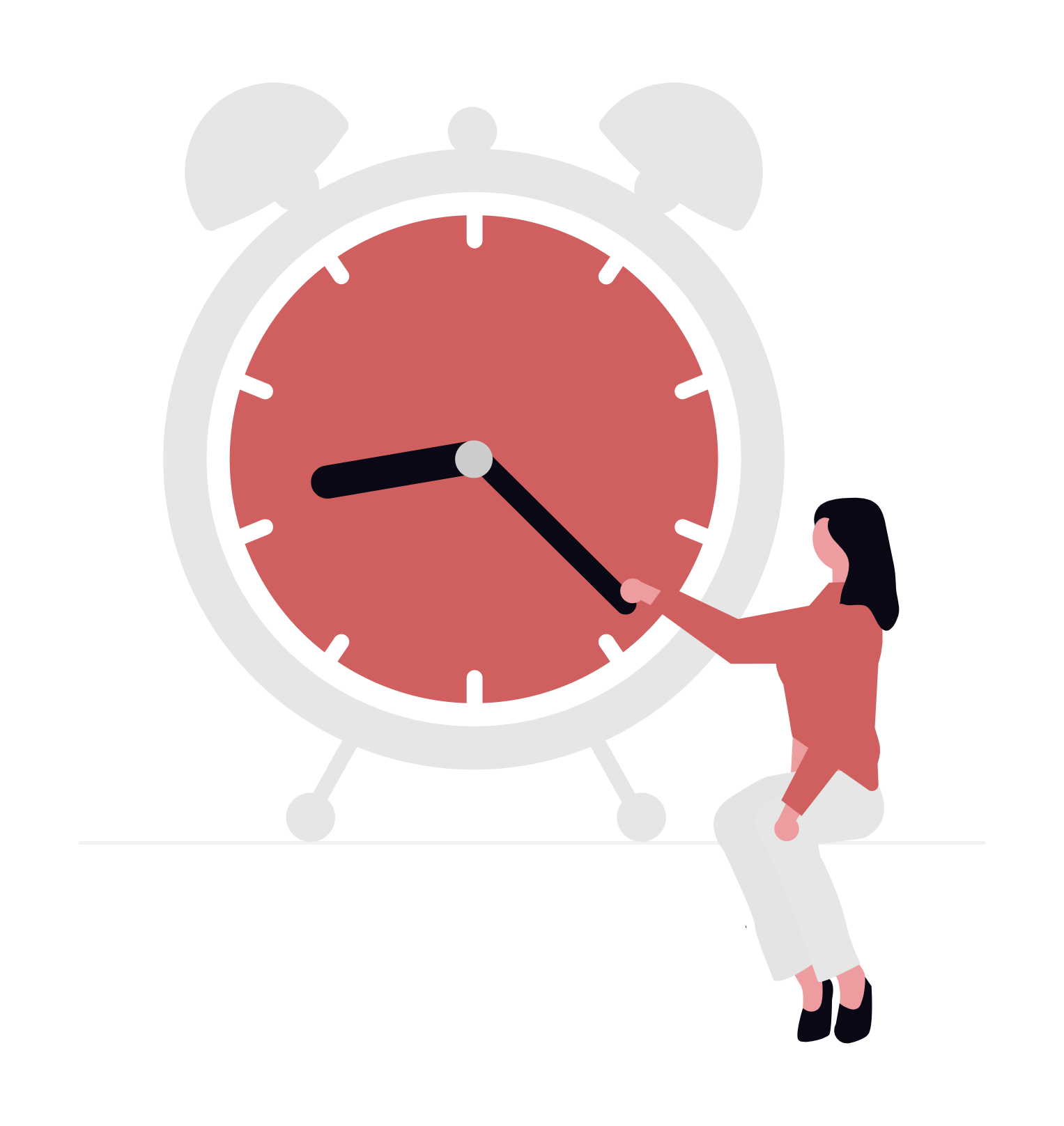
Users would like to be more involved, but find it difficult to integrate volunteering into their busy routines.
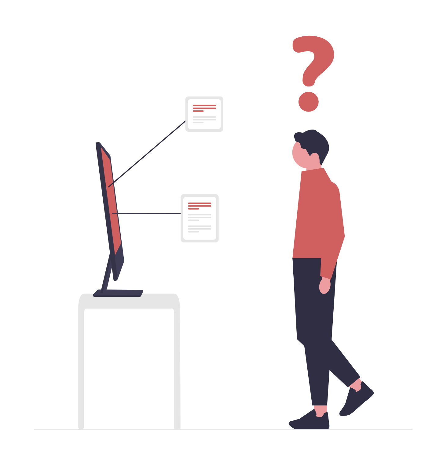
No Clear Starting Point
Users wanted to be more involved but were unsure where to start.
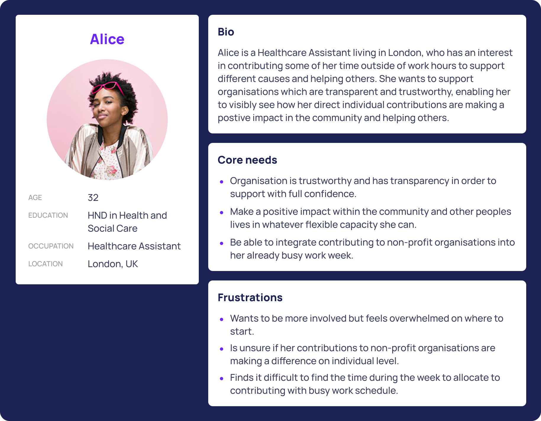
User Persona
Ideation
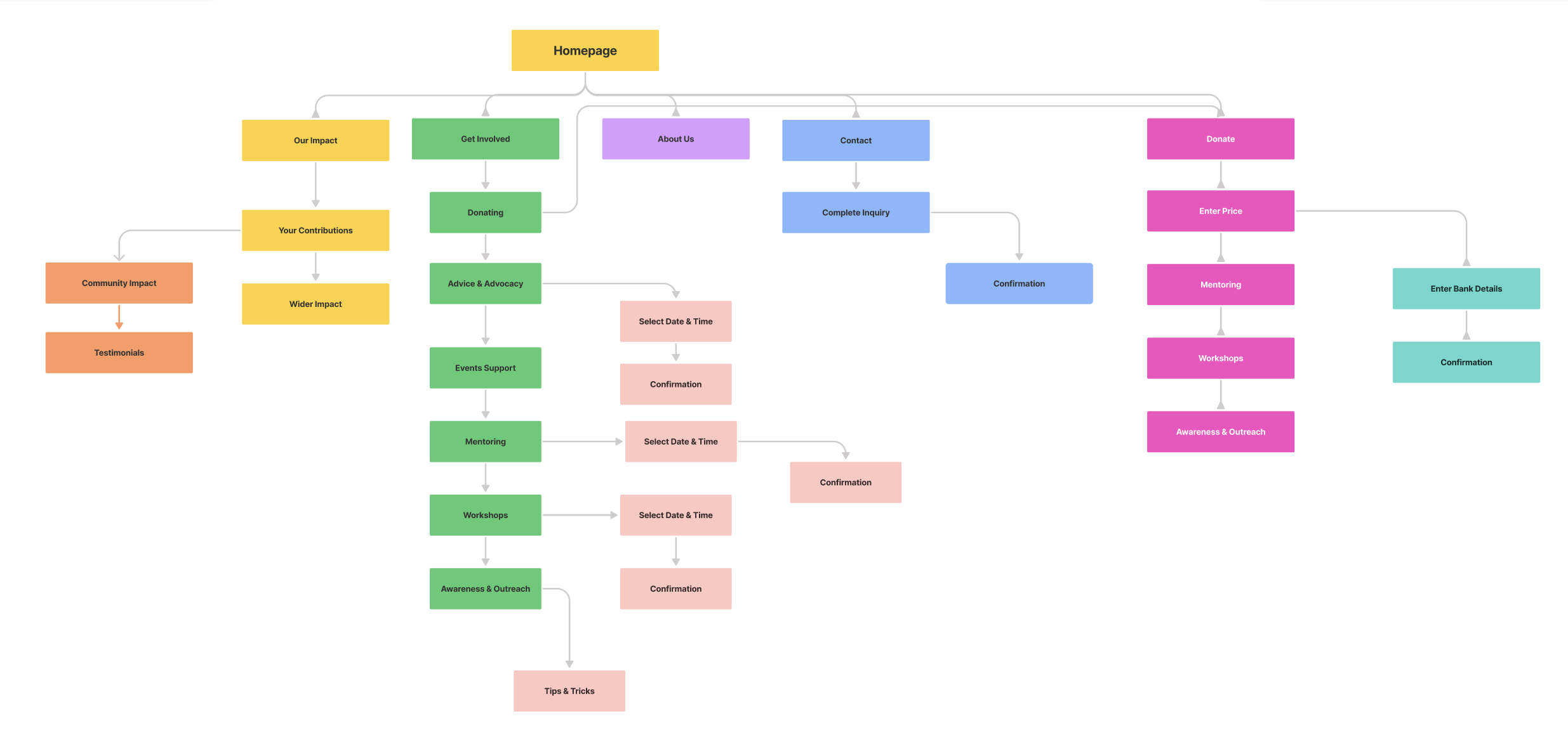
Information Architecture
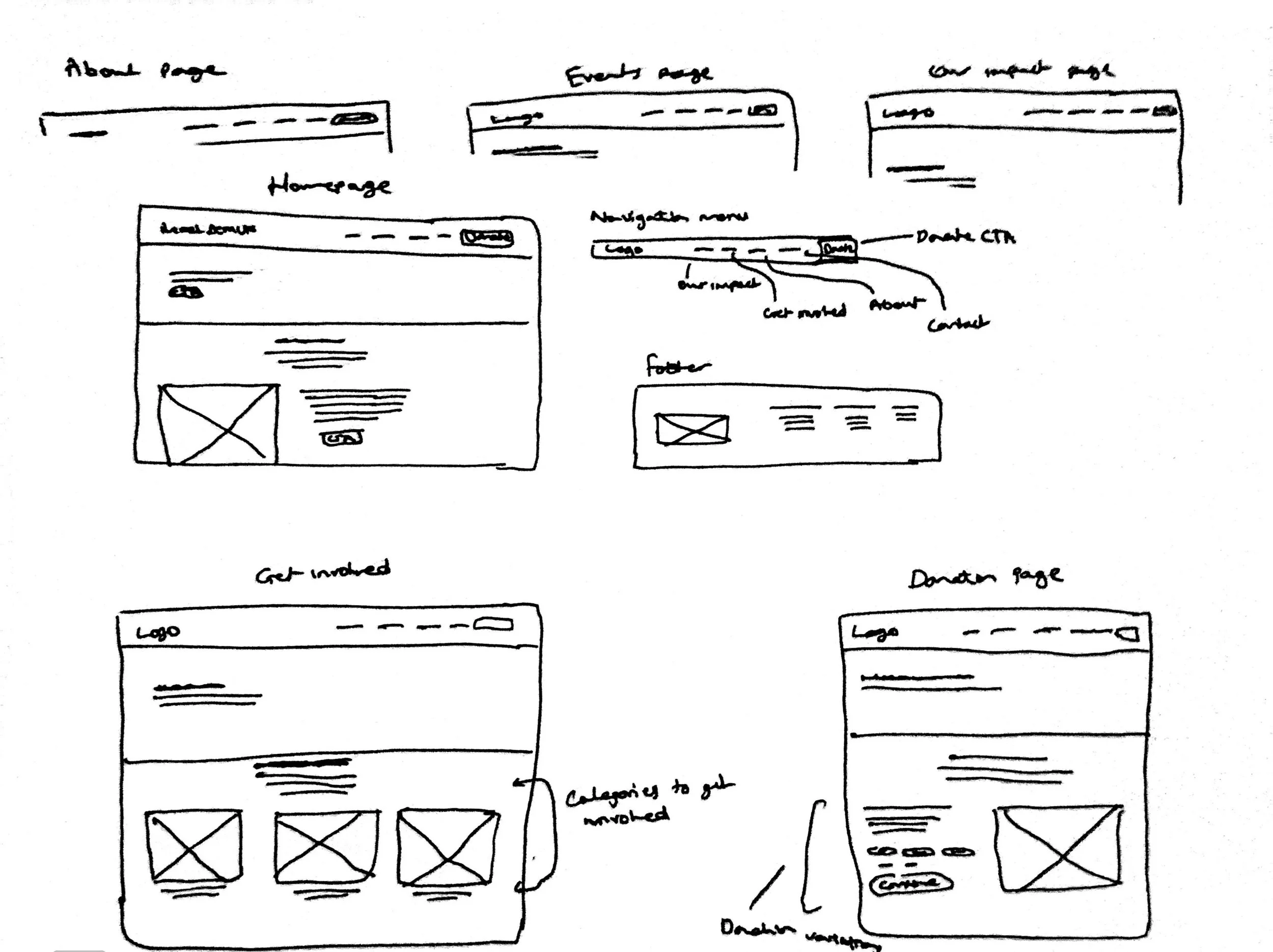
Initial Sketches
Using insights from research, I began sketching early layout ideas for Reach Dem UK’s website. Given the project’s time constraints, sketching allowed me to rapidly explore different structures while balancing user needs with the organisation’s goals before moving into wireframes.
Wireframes + Stakeholders Feedback
The next step was to start creating wireframes on Figma in order to conduct usability testing sessions later and gather any feedback. During this stage, stakeholders also reviewed the early wireframes in our meeting and suggested emphasising the mission statement and journey. I incorporated this feedback into the wireframes before moving into usability testing.
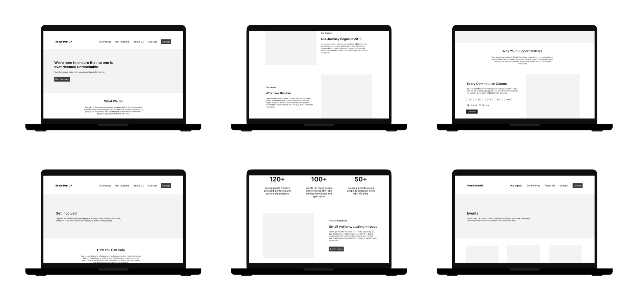
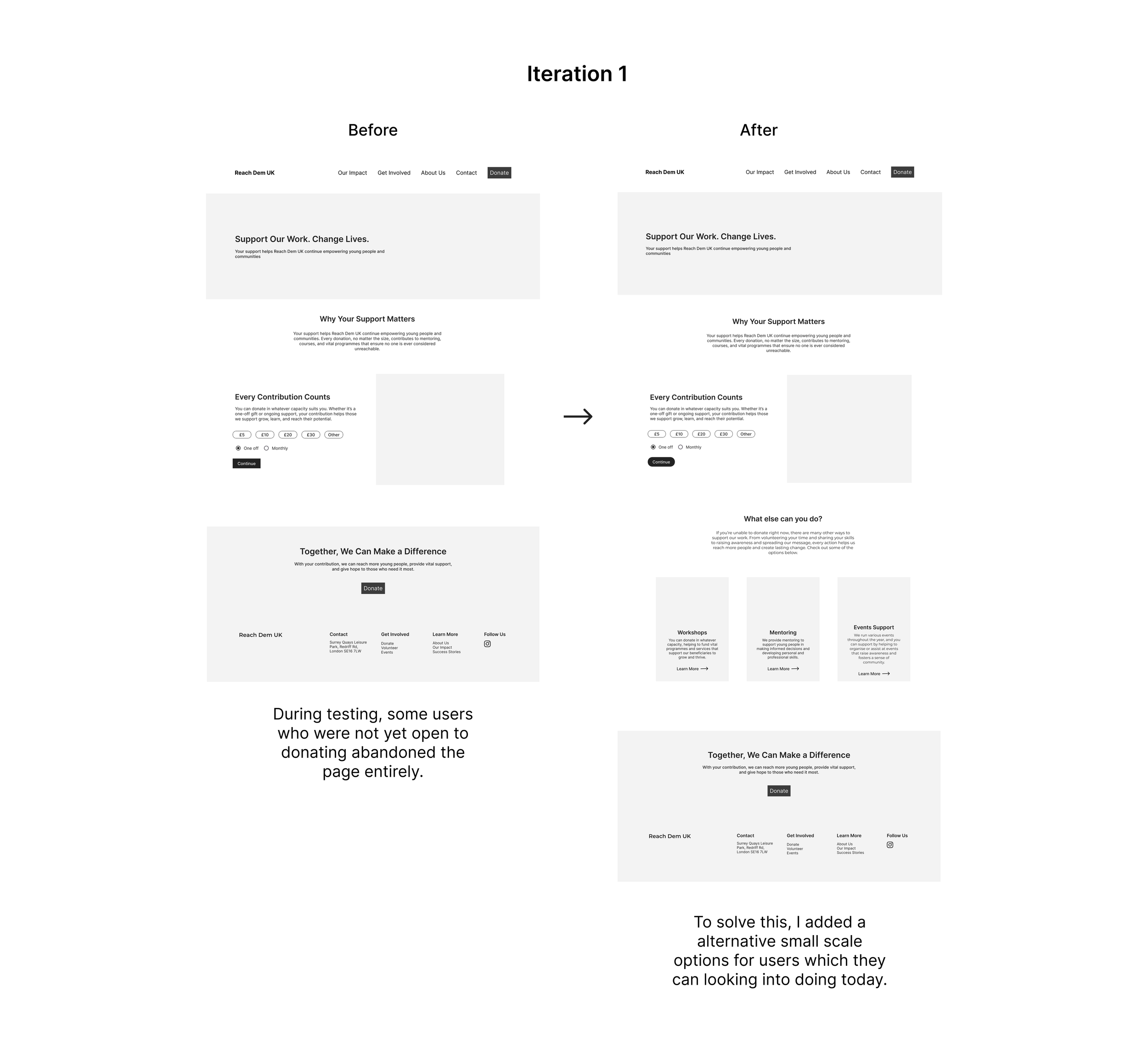
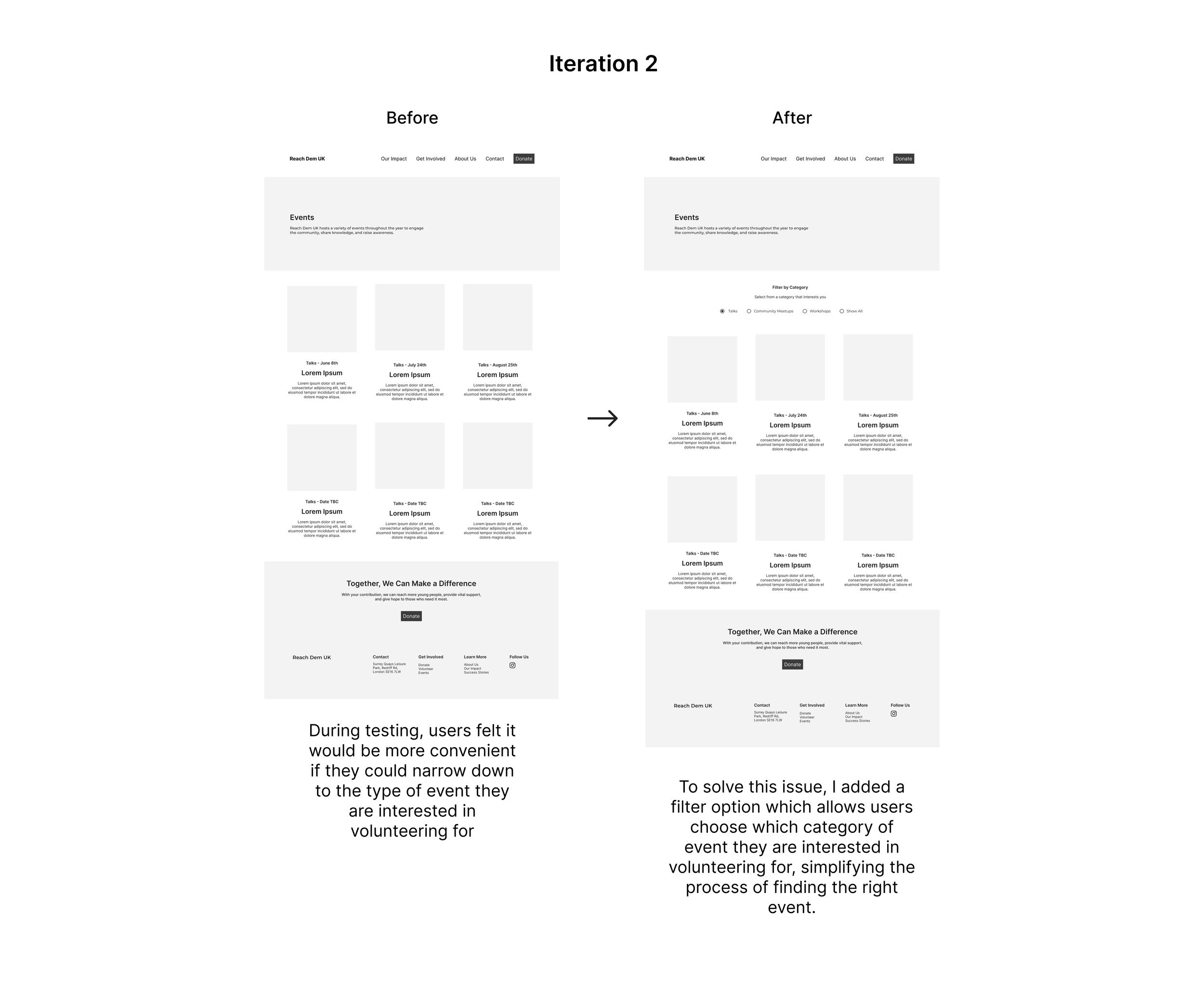
Usability Testing + Iterations
I conducted usability testing with six users to uncover any problems or opportunities and make any iterations based on objective data gathered. Users were asked to perform various tasks whilst I observed and asked for feedback. The sessions revealed some issues with navigation confusion and unclear calls to action, which informed the next design iterations.
Responsive UI Designs
Results + Key Takeaways
In summary, this was my first experience working directly with stakeholders while managing the tight time constraints of a two-week period. The website redesign, I believe, achieved the goals which were initially mapped out in the process, especially the improved site structure and simplified “Get Involved” process, which led to clear usability improvements during testing, with participants being able to navigate more confidently and sign up to different volunteering programs with less sense of hesitation.
In terms of next steps, to ensure a smooth handoff, I organised and redlined my Figma files, clearly documenting all important aspects. I also remained available to support developers with any clarifications and ensure everything was accurately implemented.
Some key learnings for me:
Designing with accessibility in mind: Adhering to WCAG guidelines on this project reinforced for me the importance of creating inclusive experiences, showing how thoughtful decisions around areas like contrast and layout can significantly improve the overall usability.
Embracing adaptability: During this project, the idea of being adaptable and flexible was definitely something which was reinforced, as there were several moments which required this. Whether that was making iterations after conducting usability testing or after receiving feedback from stakeholders.